
Choosing colors that make the entrance look and feel happy should be a top priority. After all, the entrance area sets the tone for the rest of the house, so selecting pop entryway color schemes should always be your first choice.
An entrance’s color choice should set the tone for the rest of your joyful home in addition to looking welcoming in and of itself. Make decorating a priority because it’s a great opportunity to express yourself and be creative. Here is a carefully picked list of our favorite colors to make you feel happier at home, whether you decide on something lively or tranquil. Winning room color ideas and entryway paint ideas pay attention to the atmosphere, size, and natural light.
When creating effective designs, rooms like entrances and hallways are sometimes neglected. However, they may be the ideal setting for experimenting with bold colors and inspiring designs.
It’s simple to add color to your entryway to make it feel nicer. Color is a fantastic decorating tool. Here, we’ve selected our top five color schemes after consulting with experts.
1. A SAGE GREEN COLOR SCHEME CAN IMITATE NATURE
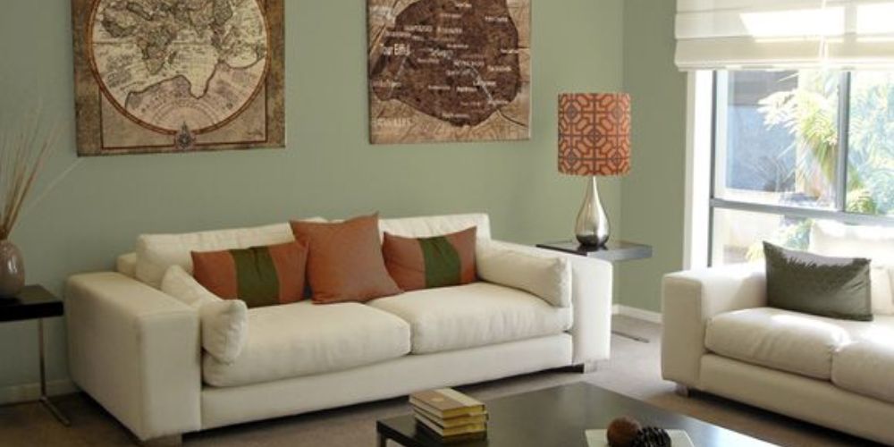
The color green is a perennial favorite in interior design because it represents nature, freshness, and vigor.
When employed in threshold spaces, the hue also serves as a useful link between the inside and the outside. The hue calms and reassures us and beautifully serves to remind us of the live world outside our four walls when it is used in wallpaper or furniture in enclosed spaces, but its advantages don’t stop there.
Sage green is extremely adaptable as a mindful décor staple and is also thought to make a great background for other natural colors. Ruth Mottershead, creative director of Little Greene, notes a shift in the use of softer hues, like sage, being utilized everywhere as a basis color, exactly as neutrals have traditionally been used.
“These are very calming, positive shades with a timeless quality, muted but not so that they fade into the background, working beautifully as a foil for similar earthy tones and richer colors like browns and ochre, which can give a more dynamic effect.”
2. USE OFF-WHITE TO IMPLEMENT A SENSE OF “QUIET LUXURY”
There are several benefits to using white in interior design. It is simple to understand why this flexible neutral is one of the most well-liked interior paint color schemes.
Decorating with white provides a clean slate that illuminates dim areas and can make even modest entryways feel airy, bright, and expansive.
According to Arianna Brissi, co-founder and creative director of Brissi, “White is an instant fixer; it can resolve color conundrums, as well as declutter and realign your room scheme.” The nice part is that it will blend in with any color you choose even if you decide to add another one.
Get tactile to prevent a white hallway or entrance from feeling cold. According to interior designer Claudia Afshar, textures are an excellent way to liven up your whites. In order to add interest to your whites, you can also use a high-pile rug, warm wood furniture, indoor plants, or textured wall covering.
3. ENERGISE WITH RED
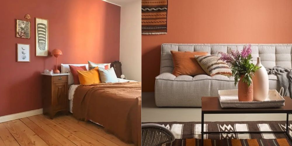
Use a cheery terracotta tone to convey joy and comfort. A combination of red and orange tones, with a focus on the red, gives terracotta its warm, earthy appearance. Warm neutral colors, organic woods, and accents in black and brown go incredibly well with it.
‘I chose an earthy red color for the hallway to immediately evoke a sense of warmth in this family house,’ explains interior designer Fabrice Juan. “As the entrance links the reception rooms, I chose a color that subtly harmonizes the tones in these spaces while creating a contrast with the black woodwork,” the designer said.
Red, the most energetic and powerful color in the world, may give drama and excitement to a room, but it can also be overpowering in areas where you want to unwind and relax.
4. YELLOW CAN ADD HAPPY OPTIMISM
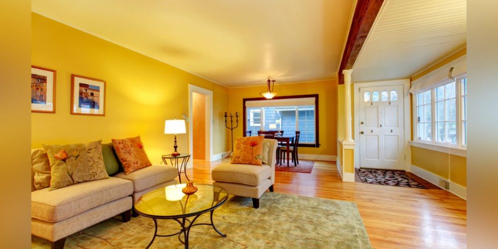
Feel inspired to design your foyer with yellow; it is the happiest color and will add warmth and energy to any area.
Yellow is a color that people are often afraid to use, but it’s a terrific color to lift a space and create interest. Because of its adaptability, interior designers love to utilize yellow as a component of decorating schemes.
According to Justyna Korczynska, senior designer at Crown, “This bright color gives the space a sense of optimism and is perfect for bringing a sense of positivity into the home.” Yellow is also a highly peaceful color, especially when combined with other calming colors like greys and soft, muted blues. The color induces serenity and a sensation of well-being, contentment, and happiness.
5. COBALT BLUE CAN RELAX THE MIND
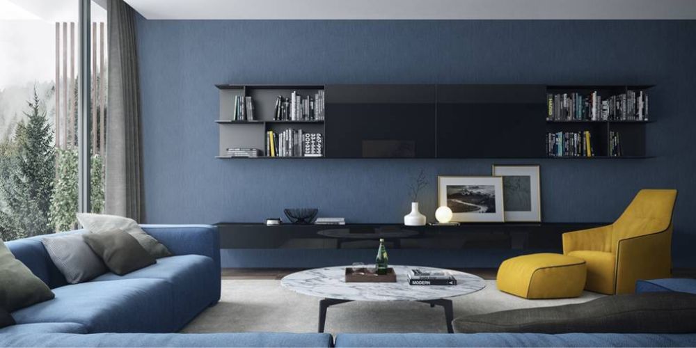
This color has been making waves ever since Moroccan design house Jardin Majorelle popularized it. According to Robert Whitaker, creative director at Claybrook, “Cobalt blue, a favorite of artists and ceramicists, is a terrific choice for interiors due to its intensity, brightening even darkened areas with its visual punch. If you want to make a statement, try for an all-over color-drenched style. The shade pairs beautifully with lighter hues for a sense of Riviera flair.
This is just what interior designer Vanessa Faivre did with this striking entrance: “I wanted to make a bold statement in this entrance hall and chose the Ressource Peintures Yves Klein blue – it is deep and has a warm tone to it,” she explains. “The living room is neutral, so the blue entrance, seen from the living room, creates a great contrast.”
David Mottershead, Little Greene’s marketing director, concurs with us that this striking room color is great: Never be scared to use blue in your home design, he advises. ‘Cobalt blue is smart and fashionable, opulent and captivating, and the latest designs eliminate the misconception that the color is chilly or masculine.’
